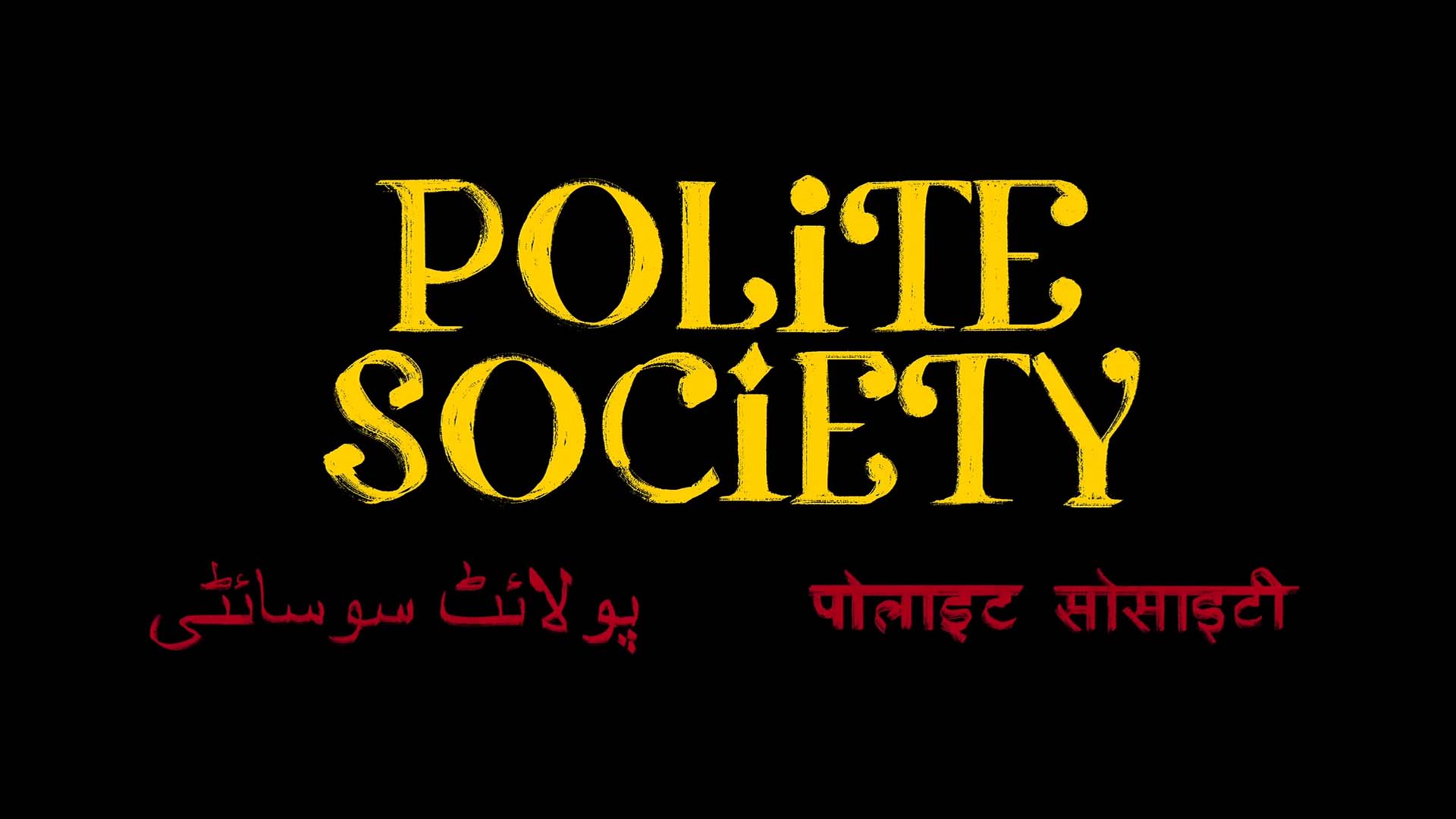
POLITE SOCIETY
TITLE CARD, IN SHOW GRAPHICS AND END CREDITS
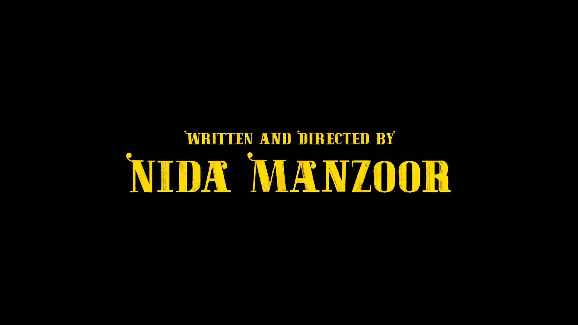
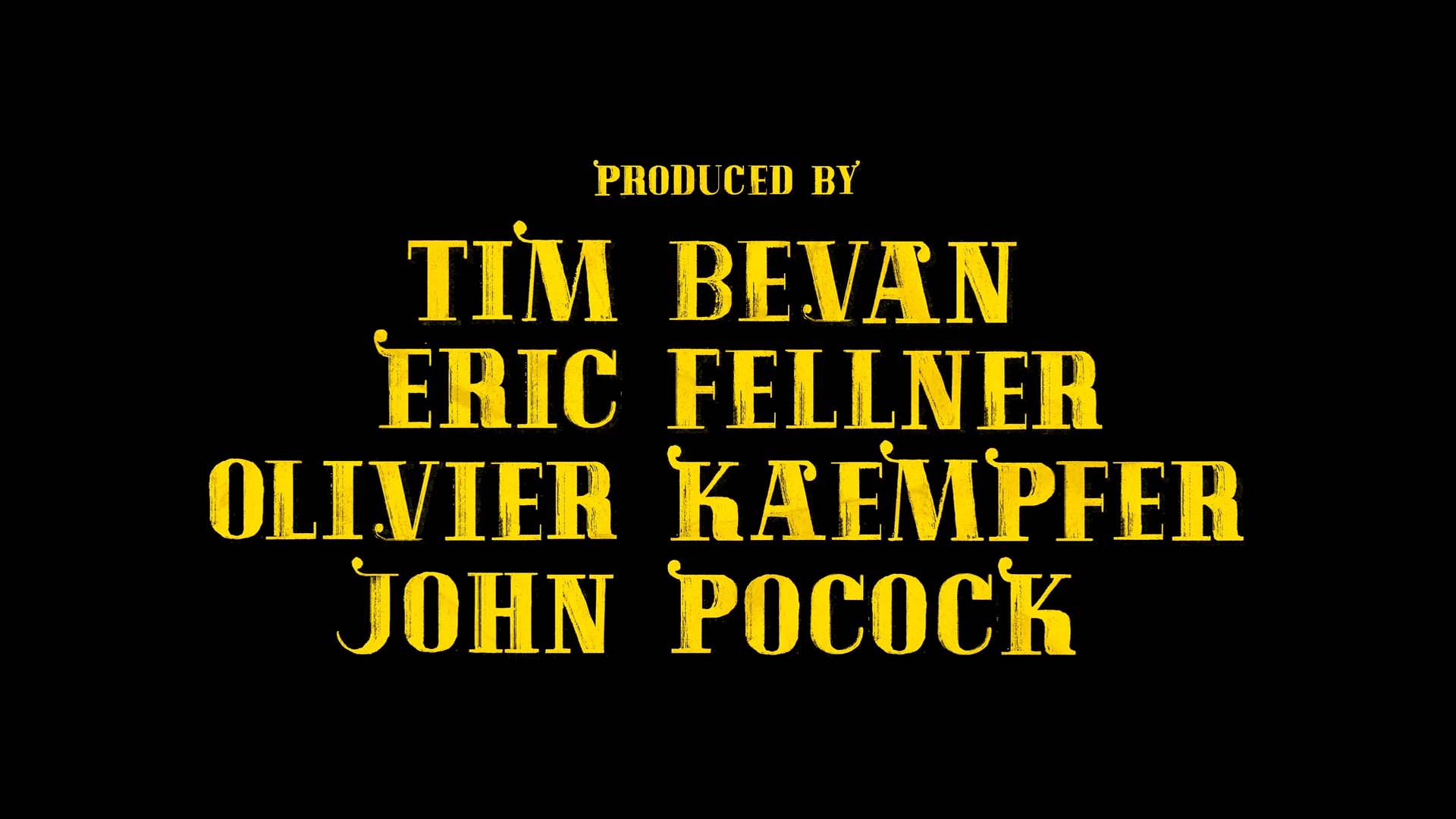
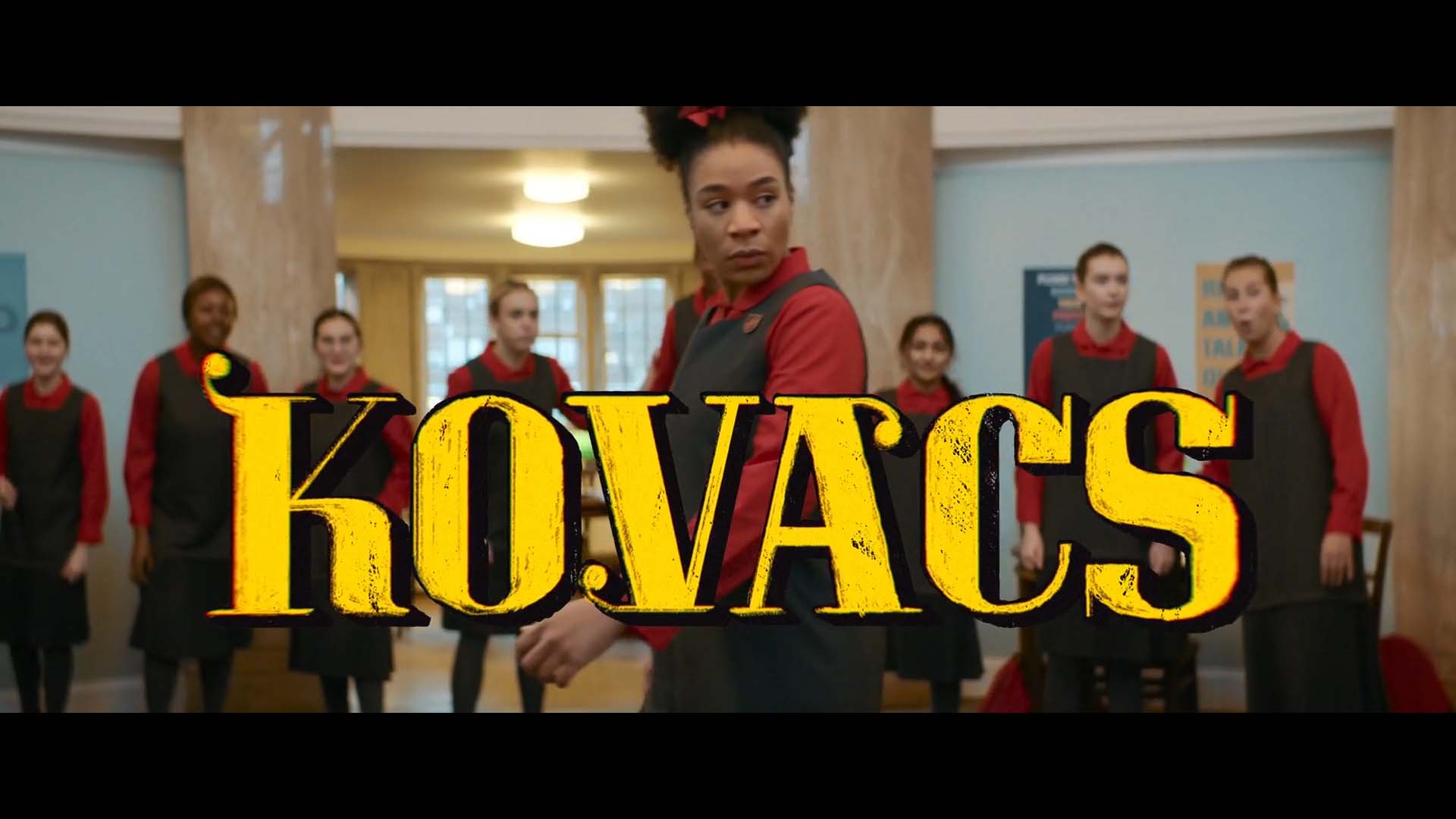
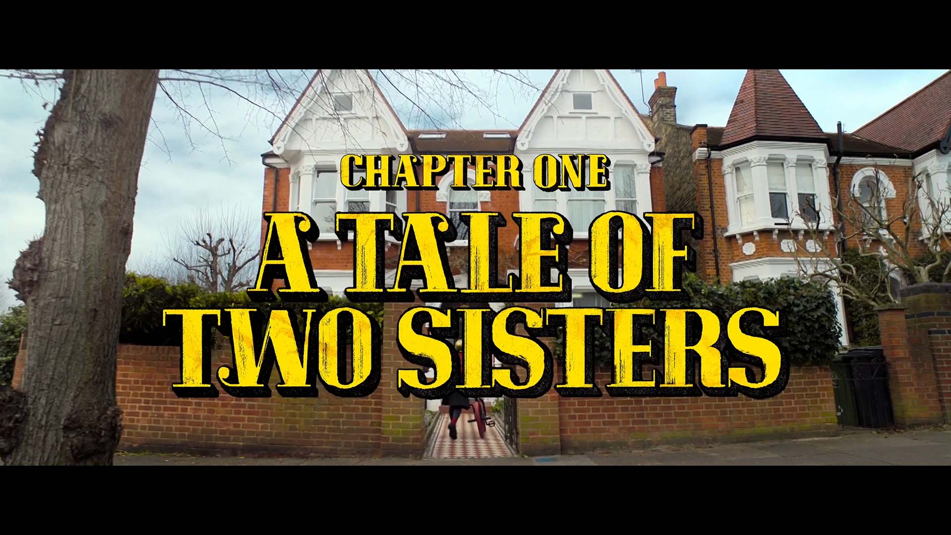
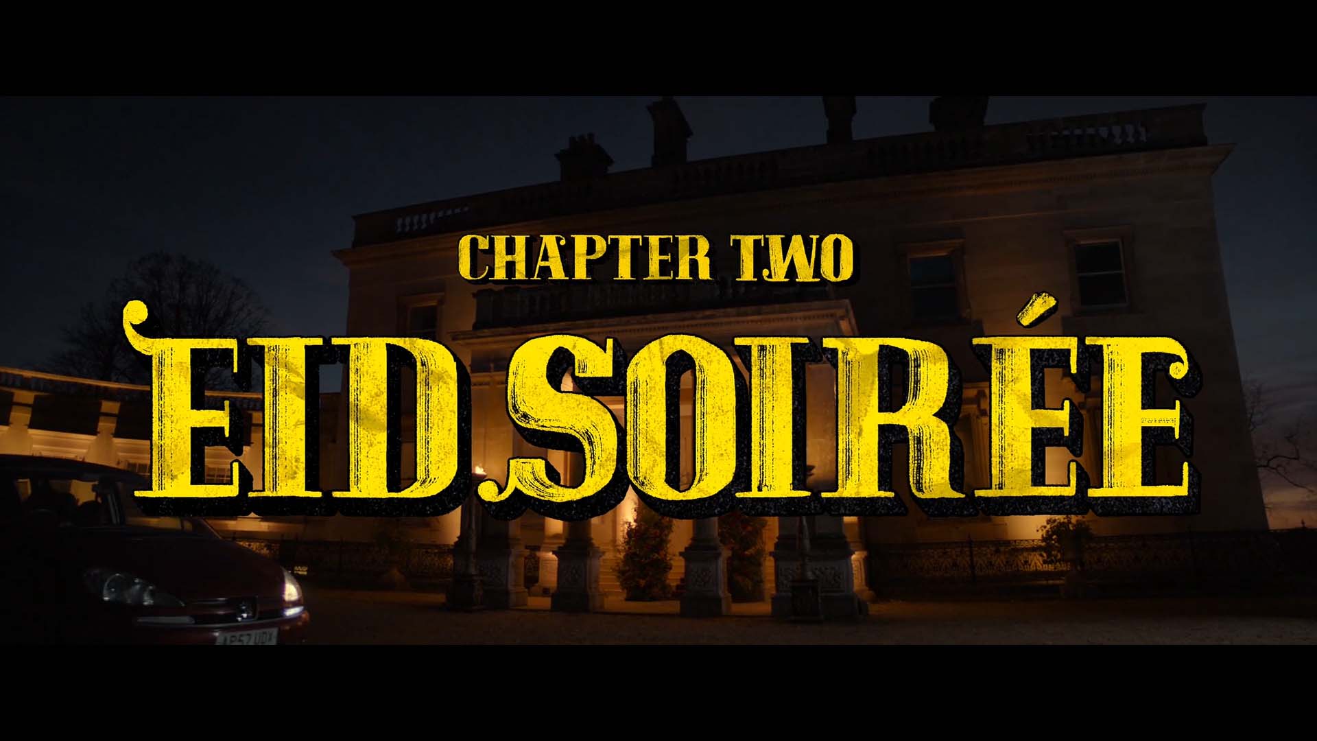
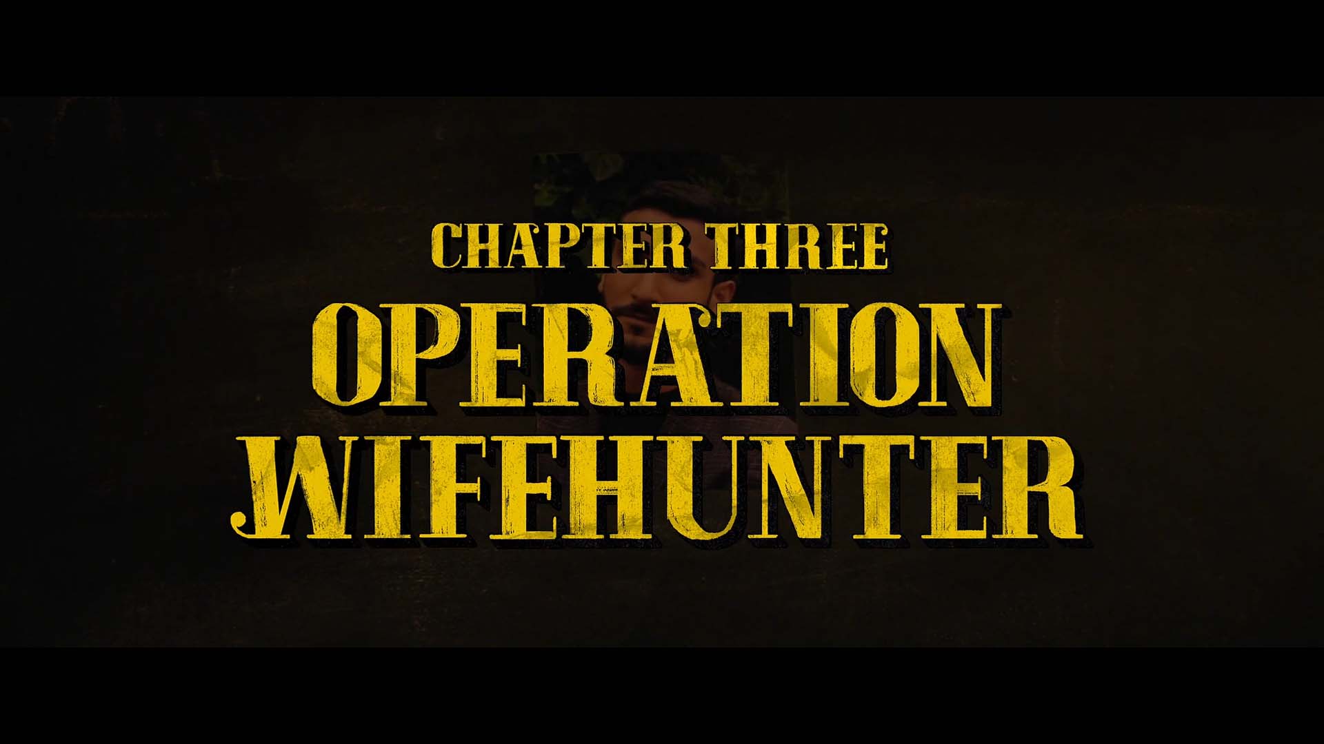
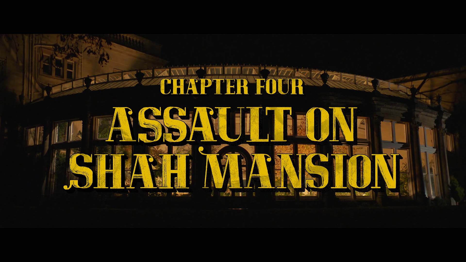
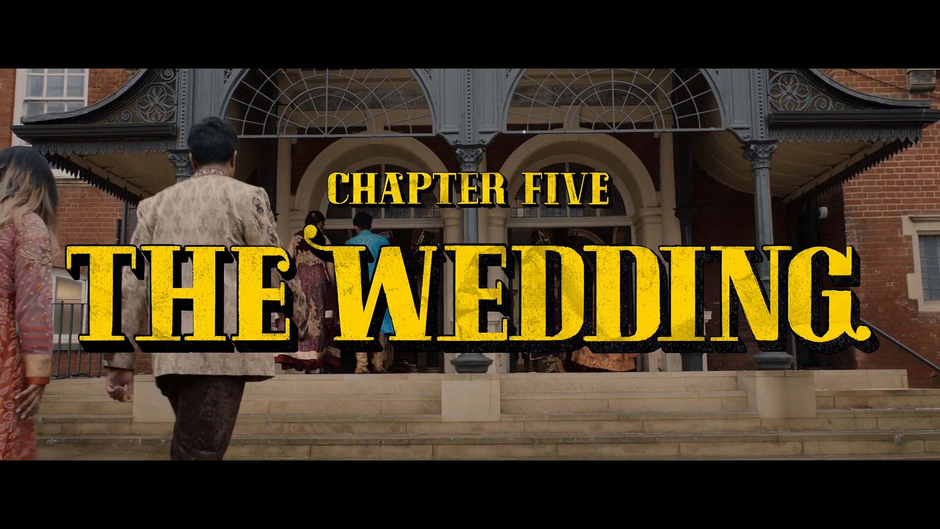
For Polite Society, we hand-brushed the type to give it a handmade, textural, poster-like quality. The chapter and fight cards featured a customised typeface with additional details inspired by traditional South Asian calligraphy, adding a touch of cultural flair in line with Nida Manzoor’s brief. The fight cards were animated to evoke the bold, nostalgic energy of 80s fighter games and kung fu films, smashing onto the screen with dynamic intensity. The typography, animated in explosive bursts, adds a unique visual language that resonates with the film’s themes of rebellion, sisterhood, and high-octane action.


WRITTEN AND DIRECTED BY
Nida Manzoor (We Are Lady Parts)
STARRING
Ritu Arya (Umbrella Academy), Priya Kansara (Bridgerton)
DISTRIBUTED BY
Focus Features (United States), Universal Pictures (International)
